
Learn from these 15 Call To Action examples (CTAs) and prompt your website visitors to take the action you want them to take. Funneling your site visitors to exactly where you want them to be, and encouraging them to take the action you want them to take, is a skill. And it’s a skill which can be learned.
It’s particularly important, of course, when it comes to monetizing your online business. Including a strong CTA for your own products or affiliate products can make or break your promotions.
It doesn’t matter whether you’re linking to your own or affiliate products, conversions consistently improve with the use of power phrases and action words (verbs).
We’ve previously looked at eight practical Call to Action examples of how to encourage website visitors to engage with contact and newsletter signups.
In this article, we’ll take it a step further and walk through 15 more Call To Action examples of how Solo Build It! members (SBIers) are setting up to convert more visitors to their most wanted response (MWR).
And we’ll look at a whole variety of pages, from exit intent to 404 “page not found”, from thank you pages to membership and course sign-ups.
Exit Intent Webinar Event Call to Action Examples
Using an Exit Intent Modal, whether for a webinar event CTA, newsletter signup, sale of a product and so on, gives you that one last chance to convert a visitor to your MWR.
Judd Burdon of AsphaltKingdom.com
Judd offered an exit intent Call to Action to make sure as many visitors as possible saw the advertisement for his webinar event before the May 20th deadline.
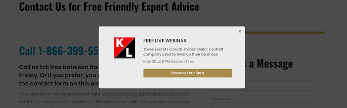
The ad tells visitors what they will get, using power words “free,” “live,” “secrets,” and “level up.” The Call to Action is to “Reserve Your Seat. “Reserve” is the action word. A simple yet solid invitation to a special event.
In-Context Preselling With Links
Affiliate text links, as well as links to your own products and promotions, placed within your main informational content can be powerful when it comes to converting your visitor to your MWR.
Margit Streifeneder’s Bloonsup.com
Here are two content text links from Margit’s site, an affiliate link and a link to one of her own pages (her directory).
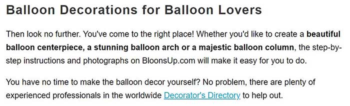
Her advertisement includes the entire second paragraph. The Call to Action is the link itself. The power phrases include “no time,” “experienced,” “worldwide” and “to help out.”
Here’s another example from Margit’s website. It’s an ad disguised as a helpful tip. Shhh, don’t tell anyone! It starts with, “New: Most of the tools and materials…”
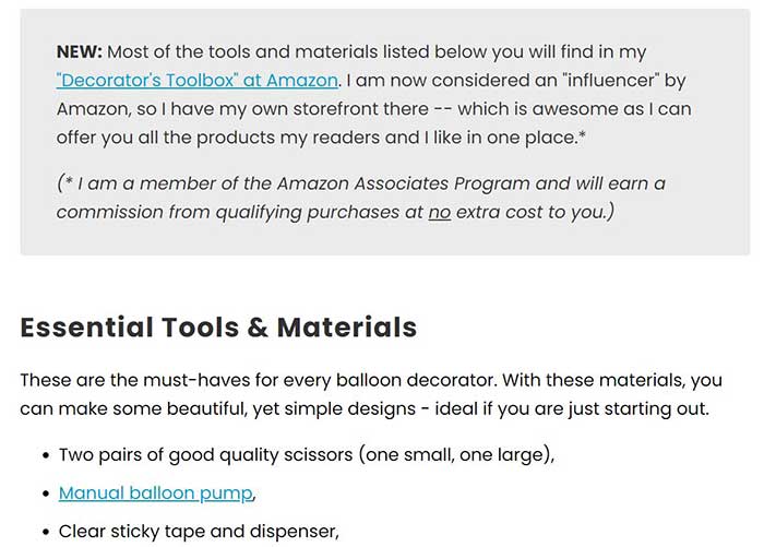
Margit explains in a matter-of-fact way about her store, her “influencer” status at Amazon, etc. All to help build credibility in the eyes of her visitors, to build trust.
Making “Decorator’s Toolbox at Amazon” a link to her Amazon storefront would be irresistible to her visitors … a “must see” since they’re already interested in making the beautiful balloon decorations shown on BloonsUp.com.
Everyone knows links and buttons are meant to be clicked. That’s why they have an inferred Call to Action built in. Action words may or may not be included, especially when the CTA is a text link within content. However, for most other instances, including an Action Word (verb) has been shown to improve conversions dramatically.
The Power Words/Phrases that Margit used include: “influencer,” “offer you,” “my readers and I like,” “in one place.” These words/phrases build credibility and trust. They make the reader want to be a part of the special group “my readers,” as well as having the convenience of everything being “in one place.”
What “power words” do you use in your calls to action? Could they be improved? Here are 20 best practices on how to make your Call to Actions irresistible.
Ayelet Porat from Go-Telaviv.com
Ayelet says the bottom Call to Action on her Israel Electric Plug page provides a significant percentage of her Amazon income.
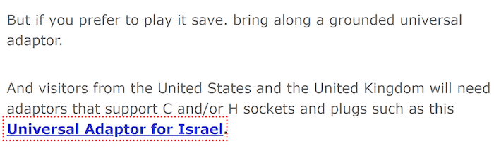
If you have your own products to sell, instead of promoting via the affiliate model, you would link to your own product’s page(s) instead of using an affiliate link.
Call To Action Examples From Thank You Pages
Who says you can’t put a Call to Action on your Thank You pages? Calls to Action can – and should – be placed everywhere on your website. As you write, always consider where’s the best CTA placement for maximum impact.
Even though your visitor converted to one of your MWRs doesn’t mean you can’t convert them to a different product or service you offer (upsell, downsell or cross-sell), give more instruction, or reassure them.
Elizabeth O’Brien of English-Grammar-Revolution.com
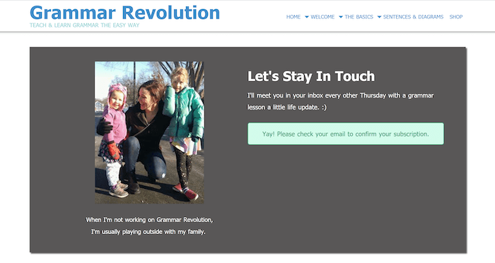
Elizabeth creates a personable and inviting Call to Action to “Please check your email to confirm your subscription.” The “Yay!” at the beginning of the Call to Action shows excitement at successfully subscribing.
The “Let’s Stay In Touch” headline and the sentence beneath it reassure subscribers and remind them of what they will get from Elizabeth and when they will get it. This builds confidence and trust.
And the image of her with her delightful family? Reassuring. This is a family-oriented, skilled person her readers will relate to.
Heidi Holvoet, Ph.D. of Baby-Sleep-Advice.com
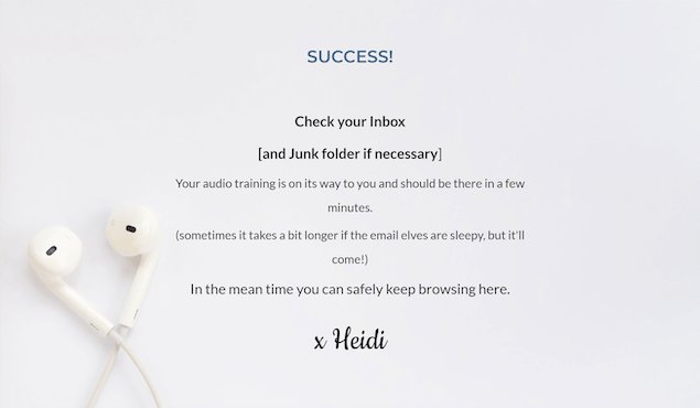
The Call to Action is to “Check your inbox…” and “you can safely keep browsing here.” These instructions give the subscriber an option for the next step (keep browsing).
It would be a good idea to offer no more than three options as the next step. These might be to the 3 pages you want to promote the most. However, don’t just link back to the home page. Give CTA options like:
- Want to avoid tourist traps? This is where you want to stay when you visit Anguilla!
- Learn how to make this delicious Brulee Cheesecake. It’s to die for!
- Need help coping with life? Join our private membership club. You’ll get access to videos, guides and more to help!
Come up with enticing Calls to Action for the CTA options you want to offer for your site and get your new subscribers back into viewing your site’s pages. Don’t just let them close the browser and leave.
Header Call to Action Examples
The header area of a website is the very first thing your visitors will see when they come to your site. It’s prime real estate that you need to take advantage of.
Putting a strong Call to Action in the header will give you much more bang for your buck than if you just put your domain name and tagline there. This is especially true with the now popular large header background images everyone wants on their site.
Heidi Holvoet, Ph.D. of Baby-Sleep-Advice.com
Who doesn’t love babies? I just feel there’s no better representation of a baby sleeping peacefully than what you see below. But, hey! That may just be me.
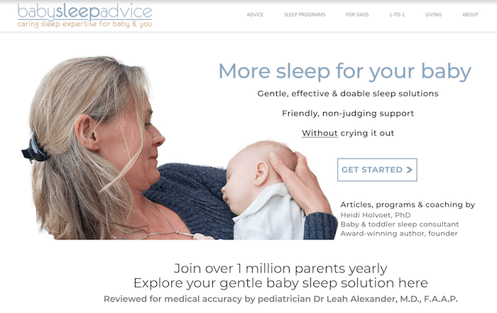
The header also has credibility-building elements that include Heidi’s qualifications and medical accuracy review by a physician. The secondary CTAs of “Join over 1 million parents yearly” and “Explore your gentle baby sleep solution here” repeats the benefit and uses power phrases to join (“you aren’t in it alone””) and “gentle baby sleep solution.”
As a parent of three, this powerful header CTA calms me, makes me feel I am in the right place. If it had been around in the 80s, I would have definitely taken Heidi up on her offer!
Elizabeth O’Brien of English-Grammar-Revolution.com
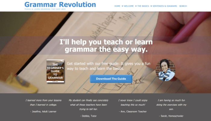
The primary Call to Action of “Get started with our free guide” combined with the benefit of “It gives you a fun way to teach and learn the basics” is the perfect build up to the CTA button of “Download The Guide.”
Having testimonials near the CTAs builds credibility and trust in the offer, which greatly improves the likelihood the visitor will convert to the most wanted response (MWR) of this ad.
Judd Burdon of AsphaltKingdom.com
Judd also uses a big header and Call to Action in his header image. He starts with the benefit (“ASPHALT MAINTENANCE & MANAGEMENT MADE EASY”), goes to the Action Word (“GET”) and Power Phrase (“advice you need”), as the build-up to the primary Call to Action (“Shop Now”).
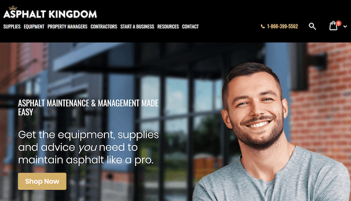
The image of the smiling man is welcoming, which puts the visitor at ease. Using a personable photo helps with the comfort level of the visitor, and builds credibility for the website.
Contest Call To Action Examples
Offering a contest on your website can bring traffic. Making it a regular event will build your visitor base.
Dr. Richard Mitchell of Dog-Breeds-Expert.com says:
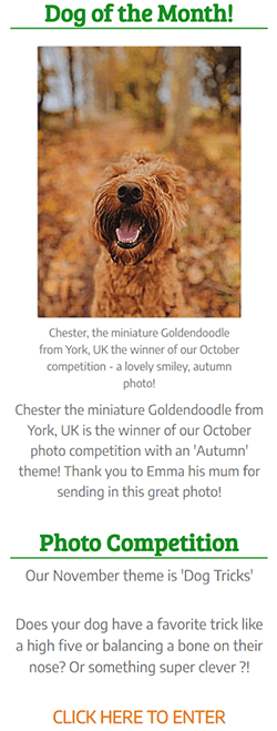 I think my best CTA is the introduction (12 months ago) of my page Dog-Photo-Competition. The winner of the dog of the month photo competition gets their dog featured on our website site-wide as “Dog of the Month,” and our Facebook profile picture for the month.
On top of this, the winner frequently shares their success on their Instagram and FB pages, resulting in a flood of traffic to our website homepage.
We chose this CTA because everyone loves their dog, and we figured they would want to show off their dog to the world! There is no monetary value attached, merely fame for a month!
We created it ourselves on Solo Build It! using the BlockBuilder tool, but use FB and Instagram to promote the results. We have not done any testing. But we always ensure our social media is updated daily.
My best advice is to pick something that will engage your audience to tell their own story. For us, dog owners love sharing pictures of their dogs! And we get more traffic as a result, which we monetise by Mediavine.
The sidebar ad starts with the current winner and a little about them. Then the headline “Photo Competition” starts the actual ad to get submissions for the contest. Richard included a couple questions to entice the reader to submit a photo. The Call to Action is “CLICK HERE TO ENTER.”
Call To Action Examples for Memberships, Classes and Other Private Areas
Using action words and power phrases within your Call to Action, such as those shown below, pump up your site’s ability to convert visitors to buyers.
They can create much needed excitement, desire, build comfort, etc., as well as remove any obstacles in your visitor’s mind against signing up for a newsletter or purchasing one of the products your site offers.
Margit Streifeneder from BloonsUp.com
Margit offers her “How to Start Your Own Balloon Decorating Business” paid eCourse advertisement as an example from her site.
The ad runs sitewide and links to her sales page for the eCourse.
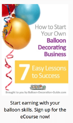
Margit uses strong power words within the image including “how to” and “7 Easy Lessons to Success,” which tells the visitor what they will get from the eCourse.
At the bottom is another power phrase, “Start earning,” which triggers the visitor’s goal to start earning an income. She then finishes off with a solid Call to Action: “Sign up for the eCourse now!”
I asked Margit what her best tip or advice was when it came to CTAs. She offered two…
- Make the CTA simple and focused. The reader should grasp within a couple of seconds the benefit s/he gets when following your CTA.
- If you run tests, test only one element at a time!
Elizabeth O’Brien of English-Grammar-Revolution.com
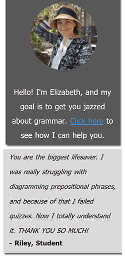
Elizabeth really wants to get you jazzed about grammar. Using “jazzed” builds excitement and a desire for the product.
The offer includes a linked “Click here” as her Call to Action, with “Click” being her Action Word.
She also uses “how I can help you,” another power phrase coming from the Safety Power Phrase Category, which helps to improve conversions.
Beneath this ad she also added a testimonial, which helps build credibility for Elizabeth, the site, and her paid course with lifetime access. The lifetime access soothes any concerns the buyer may have about having to complete the course within a limited time frame.
Make Your 404 Error Page Do Double Duty!
It’s going to happen, you just can’t help it. Visitors will come to your website, or be moving around your site, and they will click a broken link. They will see the ugly, boring 404 Error Page when they do.
A 404 Error Page should give those who do land on it some means to find out where to go next on your site. You don’t want them to leave, so you need to grab their attention. You can use humor (it works well on this type of page), chatty text, or a more formal approach, depending on your niche.
The biggest thing to know is your target market. Once you have that, it gives you more targeted options for your 404 page so you can get your visitors back to browsing your site or buying your products.
Dr. Richard Mitchell of Dog-Breeds-Expert.com
Richard uses humor to acknowledge the broken link and offers informative text to help his visitors find what they were looking for.
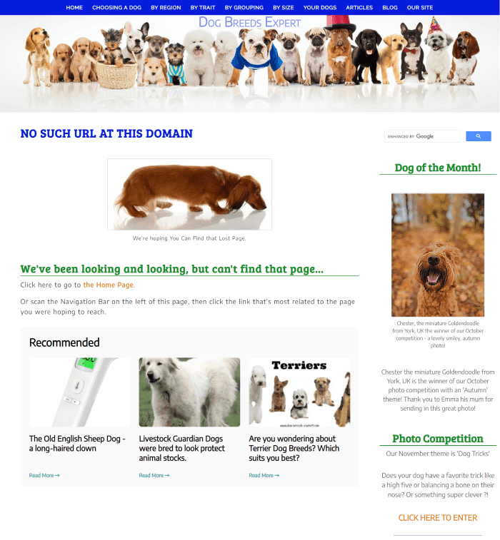
I love the sniffing dachshund image and headline used, “We’ve been looking and looking, but can’t find that page…” It’s a perfect example of using a bit of humor to help relax what might be an otherwise frustrated visitor. The informative content links include the Dog of the Month ad in the sidebar, discussed earlier in this article, plus 3 recommended reading items. Really well done, Richard!
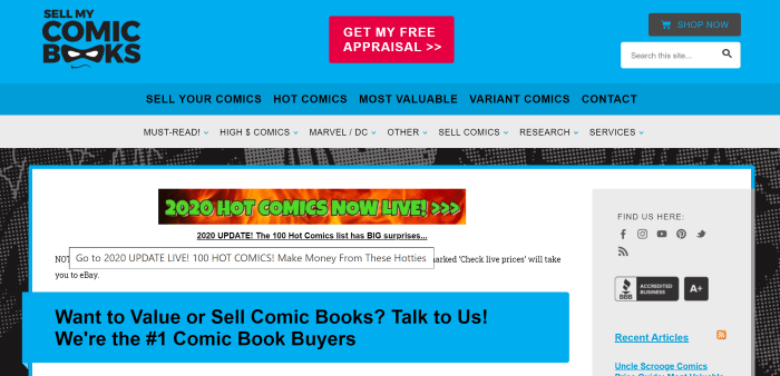
Ashley Cotter-Cairns of SellMyComicBooks.com
Ashley’s 404 page is short and to the point. There’s nothing wrong with that. Being a shorter page, it can reduce visitor frustrations more quickly.
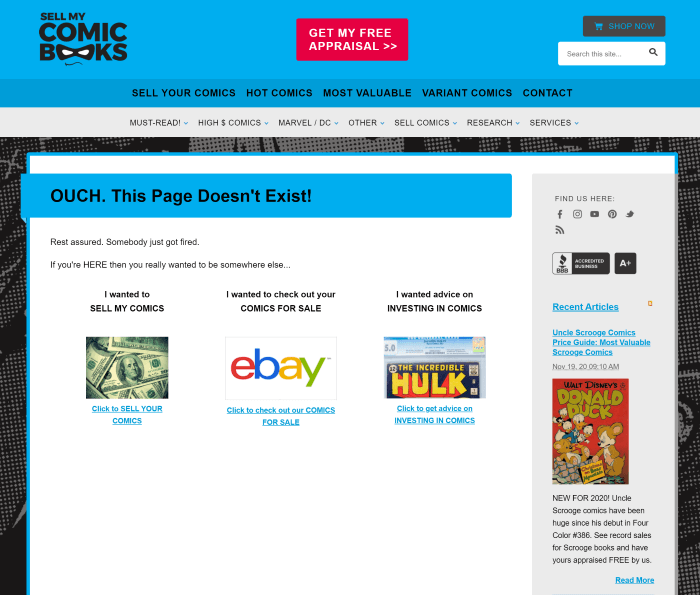
While the page is short, the humor carries through. The three link options below the Ouch! get to the point of what most of his target market is looking for. Each carries its own Call to Action to “Click to…”
Ashley also has the What’s New BB2 block vertically on the right, adding a few more options for his visitors.
Cath Andrews of Raising-Happy-Chickens.com
This is probably the longest 404 page I’ve encountered. I do have to say though, I think it’s my favorite so far. When I read the page, I laughed. I was thoroughly enchanted by the humor and visual elements.
I’m sure her visitors will be too. Who can be frustrated with something so informative and entertaining at the same time?
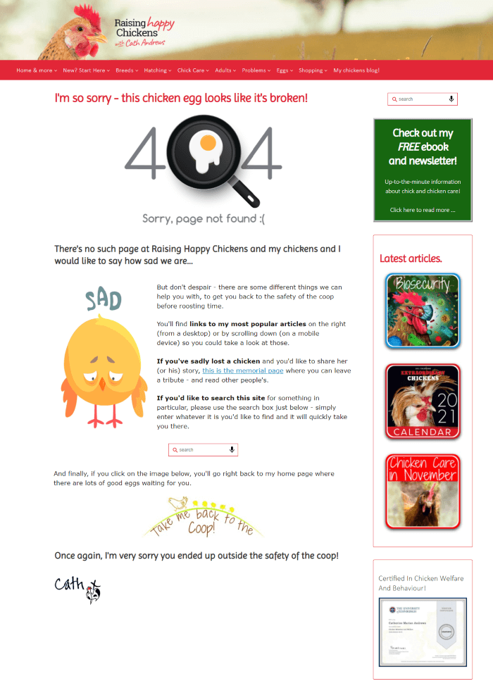
She keeps the number of options low in the content area as well as the sidebar despite the longer page. Not overwhelming your lost visitor with too many options makes for a less frustrating experience when a broken link mysteriously happens.
Multi-Page Call to Action Examples — Big, Bold and Beautiful
Sometimes one page is just not enough! Using multiple pages as a series isn’t seen very often. It isn’t about a multi-page form, but instead a multi-step method of managing expectations and still getting the appropriate information you need to provide a service.
Ashley Cotter-Cairns of SellMyComicBooks.com
Ashley’s MWR for his site is to get requests for appraisals. That’s how he makes money, buying and selling comic books, so increasing the number of appraisal requests is of primary importance on the website.
“We were redesigning the website and wanted to make it as obvious as possible for people to find the appraisal request. The red button provides a big contrast to the blue background.”Ashley
I asked Ashley what prompted him to create this style of CTA?
“By this time, we had good traffic and the site is a lead generation engine essentially. We wanted to max out the number of appraisal requests.”Ashley
The following images will take you through the process Ashley set up to get more appraisal requests. However, that isn’t the only thing he wants. He also needs to manage the expectations of his customers.
Why manage expectations? It’s important to have satisfied customers, to not leave them feeling like they aren’t getting the best price for their comic books from SellMyComicBooks.com. If you get enough people who are disgruntled, it can create a bad reputation for the site, and it won’t be trusted.
Ashley manages expectations by providing four steps through the appraisal process his customers need to follow. They will essentially value their own comic book(s) first using the tips on SellMyComicBooks.com. Then they request the appraisal from Ashley who will do the same.
If the customer is over-estimating, then Ashley or his partner work with the customer to bring their expectations into line with the reality of the market. Below are the 4 steps in the appraisal process.
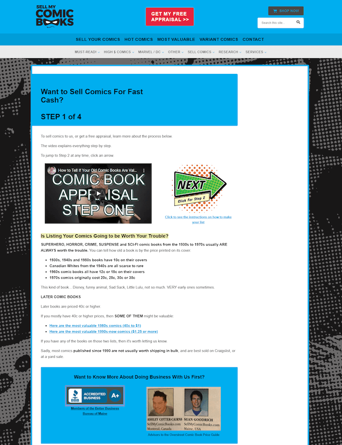
In the first part of the process, the page deals with how to tell when your comic book was issued based upon the price of the comic book. It goes on to say how rare each decade may be, which directly affects the price you can get for the book and provides links to help you look up the most valuable books.
The page has a video next to a big retro “Next” arrow button. This gives quick access into the next step for those who are returning to complete the process vs. what a new visitor might do (which is read the page or watch the video before moving to Step 2).
The video reinforces what is on the page and gives you a chance to see Ashley. It’s quick which allows you to move right onto Step 2 after watching the video. Ashley’s hand movements during the video are great visual cues too.
Videos used during a sales or step process should be relatively short and to the point. Ashley’s done this well, with the video coming in under 4 minutes.
Ashley’s hand movements and vibrant voice keep your attention. You don’t want to risk your potential customer dozing off!
It’s important, if you’re going to use a different style button from the expected rectangle with solid background, that the button fits your niche.
SellMyComicBooks.com’s retro-style button fits the era of the most expensive comic books … the 1930s to 1950s. Also, the style is reminiscent of the textual and visual design used in comic books over the years. This button is a great fit for the niche and visual style it represents.
Next is building credibility and trust. The blue box has the BBB Accredited Business icon with an A+ rating, pictures of Ashley and his partner, Sean Goodrich.
The next image shows the big, retro “Next” button (even larger than the first one) to take you to Step 2 and the start of testimonials, a lot of testimonials from those who did business with Ashley and Sean.
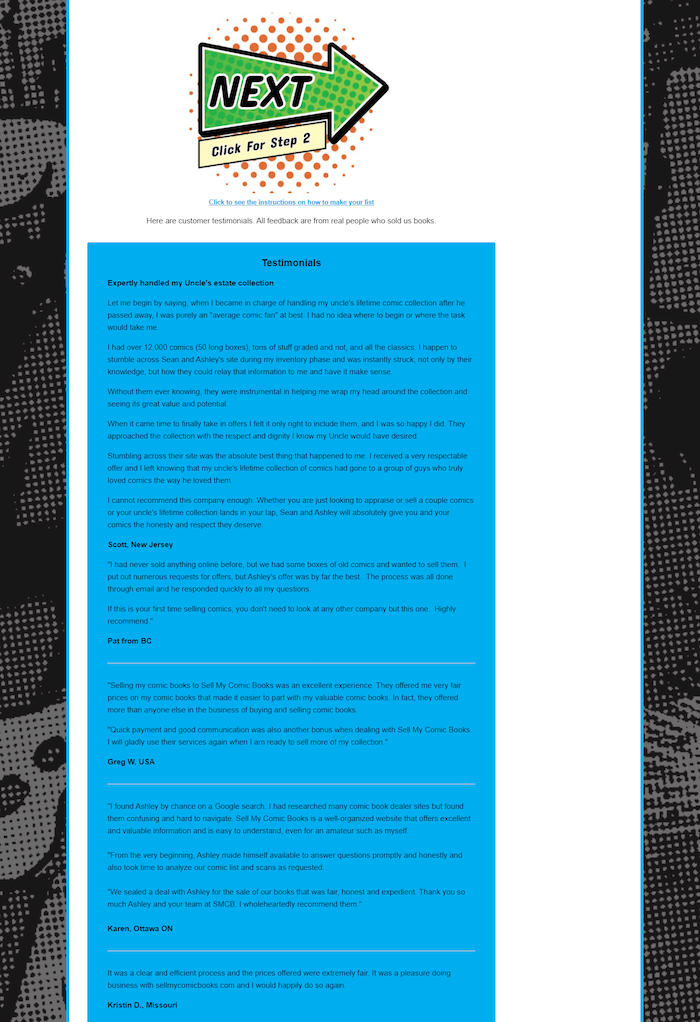
The website has a larger number of testimonials and uses them effectively to help potential customers trust the site as well as Ashley and Sean. Testimonials also help encourage the potential customer to finish the process of getting their free appraisal.
As we have already seen, multiple Calls to Action are happening on this page. Always the same CTA, the big, retro looking button for the “Next” step. How many buttons should be on the page?
Ashley has a button or link CTA on every “screen” of the page. This is so when the potential customer is ready to move to the next step, they won’t have to do a lot of scrolling to find the button.
The less friction in the process, the easier it is to get the customer from Point A to Point B. The more friction there is, the fewer customers who will make it through the process.
What is “friction” as used here?
Friction is the point in the process where potential customers get stuck. There may be one, but there are more likely to be multiple places where this might happen.
If they get stuck, they may get frustrated and give up, or put up a defensive attitude toward the process.
Either way, these customers are much less likely to finish the process at all, or if they do finish, they may not trust they have the best deal.
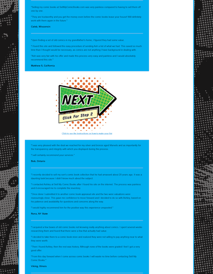
You’ve probably noticed the buttons are the same, have the same text, imagery, CTA, etc. Repeating the same button throughout the page reinforces the Call to Action and what to expect.
If you used different buttons for each spot, it could “break” the brand of your website and would likely be “jarring” to the potential customer, making them wary of the process.
While some may say consistency is boring, it is reassuring to the one viewing that consistency within a website/brand. It also provides support for the brand and gives a professional appearance to the website.
The same style continues down the page showing testimonials and more “Next” buttons to Step 2.
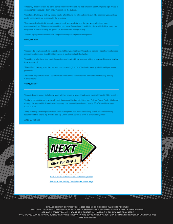
Providing the final button of the page at the very end is that last chance for the potential customer to move forward through the process and go to Step 2.
This page has been all about education and credibility. Not a sales process, but you still need to convert the potential customer to the next step.
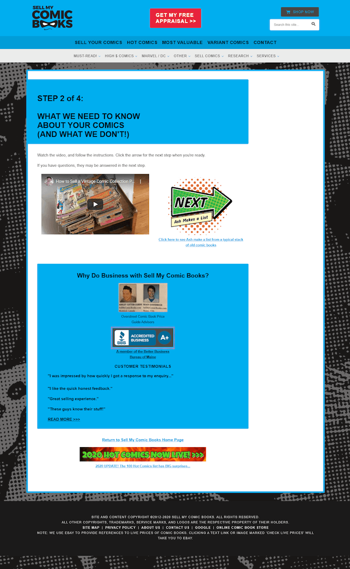
Step 2 is all about making your list of comic books the way Ashley and Sean need it done. They provide a video of what they need to know and what they don’t. Helping site visitors see, as well as read, what they need to do ensures Ashley and Sean are most likely to get the desired result.
Again, we see the “Next” button beside the video. After that is more about trusting SellMyComicBooks.com, the BBB (Better Business Bureau) symbol and rating and more testimonials.
With so much info to convey, the page is pretty short. However, getting to the point, getting potential customers to create their list is the primary response Ashley and Sean are looking for and this approach works for them.
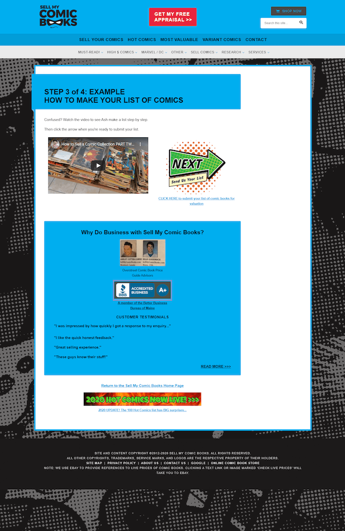
SellMyComicBooks.com continues to use a professional design consistently throughout this process, including a video, the “Next” button beside the video, and more credibility building. It’s familiar by now, comfortable for the potential customer.
When a potential customer is comfortable on a site, they stick around, convert to your most wanted response, and browse more pages. All good things for your site and your bottom line.
When potential customers are not comfortable, they leave. So work with a consistent design and layout so you can convert more of your visitors to customers.
Step 4 of the process is the form where the potential customer can provide the information and “The List” Ashley and Sean need in order to provide the free appraisal.
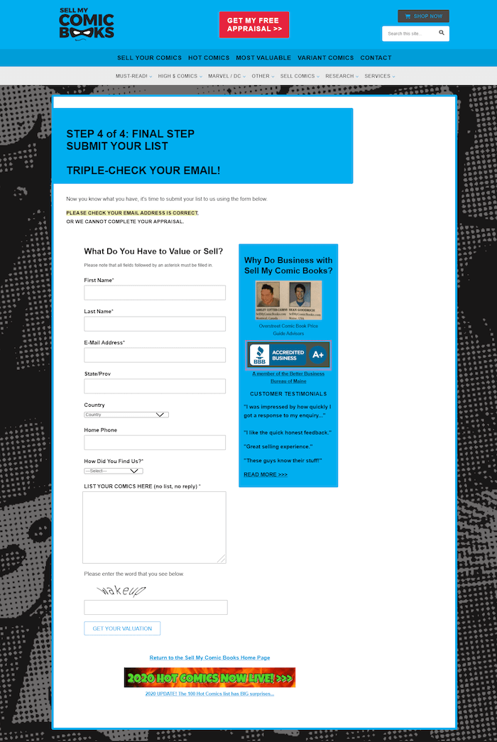
The form asks for the basic information on you, how to contact you, what country you are in, how you found SellMyComicBooks.com, and a box for you to enter in “The List” you created in Step 3.
If you really want customers to complete your forms or orders, don’t ask for any more information than you really need to know.
Ashley really needs to know most of what is asked for in the form. The information about you and how to contact you are required. Ashley can’t contact you without this information.
The only item requested that isn’t related to your appraisal is about how you found SellMyComicBooks.com. However, your answer will help Ashley and Sean evaluate and refine their marketing efforts so it’s an important metric that could affect their bottom line, and may earn you a bit more on the comics you want to have appraised.
Ashley has been with Solo Build It! (SBI!) for a long time. He has done regular updates to his original SBI! Success Story, where you can learn more about Ashley, how he started with SBI! and his progress toward success.
Call To Action Examples: Our Top Tips to Improve Your Results
“…look at websites in your industry and see how they word CTA’s. Would you buy from them or sign up or take a look at something they drew your attention to? If so then adopt and adapt to your situation/industry.”Jackie from CreateYourPerfectBusiness.co.uk
“Have a very clear purpose in mind. Try to disconnect yourself from what your emotional reaction to your own “baby” is. Have a neutral party look over your work and listen to their feedback. Test stuff. I know we didn’t do a very good job of that — the result was so enormous, over 100 percent improvement, that we were overwhelmed by email and didn’t think to test.”Ashley from SellMyComicBooks.com
What Types of Ads Will You Craft For Your Calls to Action?
CTA button or text link? While buttons may have an edge, each niche website is different. Visitors are different and have been known to upset the best practices apple cart. So, what do you do? You test.
Our examples got great results, but trying to replicate them doesn’t mean you will. You need to base your Calls to Action on your knowledge of your own niche and target audience.
What does that mean for you? Every article your write, every page you publish, needs to have its own well-thought-out Call to Action.
So, set it up. And then, test it. Leave it for a month and then review your results. Did it work? How many clicks did it get? How many people bought, or signed up, or went to another page?
And remember that best practice can change over time. Always keep on top of what’s current. Consider what’s working for others in your niche.
Stay focused so that your page provides a cohesive presentation, and allow yourself enough time to test the various elements to get the best conversion you can.


Latest posts by Debs Seeber (see all)
- 15 Call to Action Examples That Are Proven To Work - January 22, 2021
- 8 Call to Action Examples to Fire Up Your Marketing - June 9, 2020
- 7 Strategic Ad and CTA Placements for Maximum Impact - May 26, 2020